ProVantage X (Dashboard)
Project Summary
Transforming the Landing Page into a Centralized Control Tower
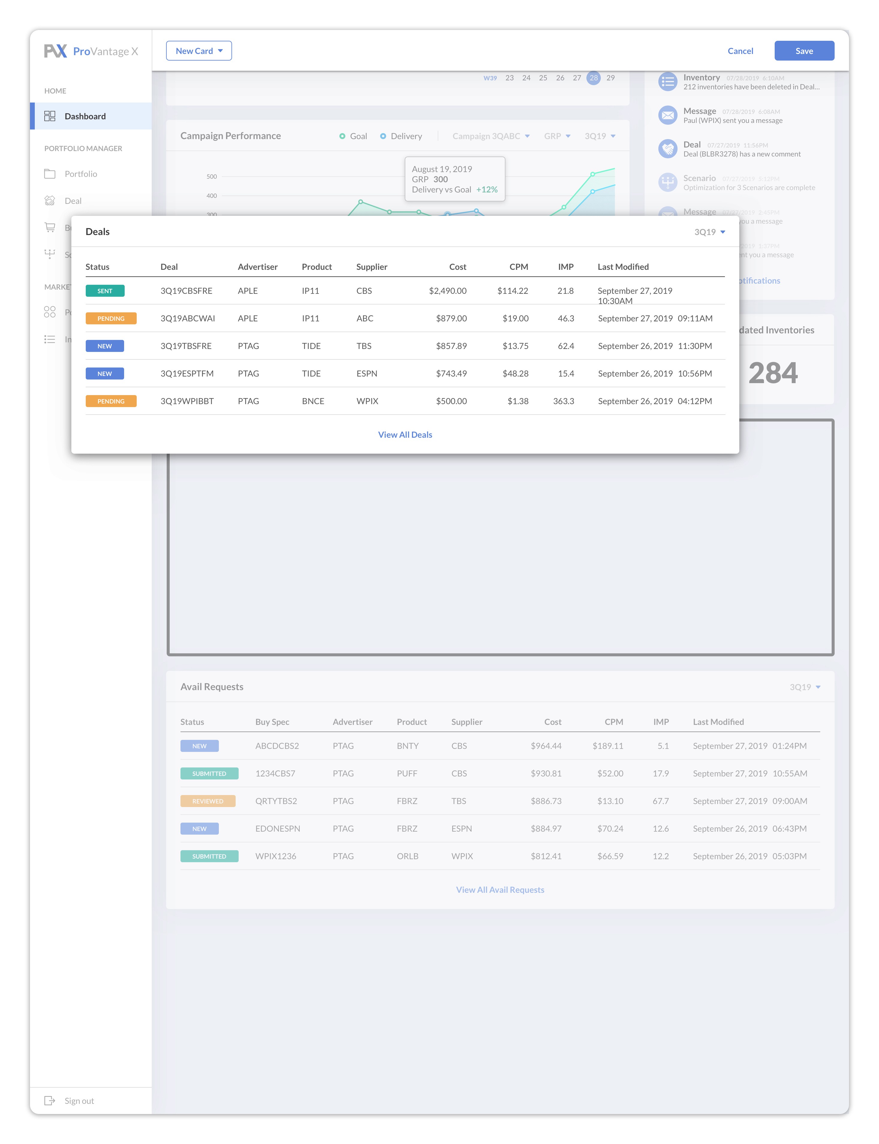
The Dashboard allows the users to see an overall summary of everything that is going on in one quick view. As a landing page, it is also the starting point for navigating through the platform. It will provide information through tables, graphs, calendars and many other widgets, as well as shortcuts that will take the users to the relevant screens right away.
Users & Issues
Users
Demand Side Platform users (Media planners, media buyers, supervisors, etc.)
Supply Side Platform users will have their own dashboard/landing page as well, but this specific project was for the DSP Dashboard/Landing Page

Issues with the current landing page
There aren’t any useful functions to it
The Visual Design is very unappealing
As a starting point, it doesn’t really guide the users to navigate through the platform
Issues with the system in general
There is no place for the users to be able to view a summary of his or her work
Every time users return to the platform,
they have difficulties remembering where they left
it takes them time to realize what actions they need to take
Users often feel lost in the platform and have navigation issues
Many users are unhappy with the Navigation Bar that only displays the top level menu titles
Initial Solutions
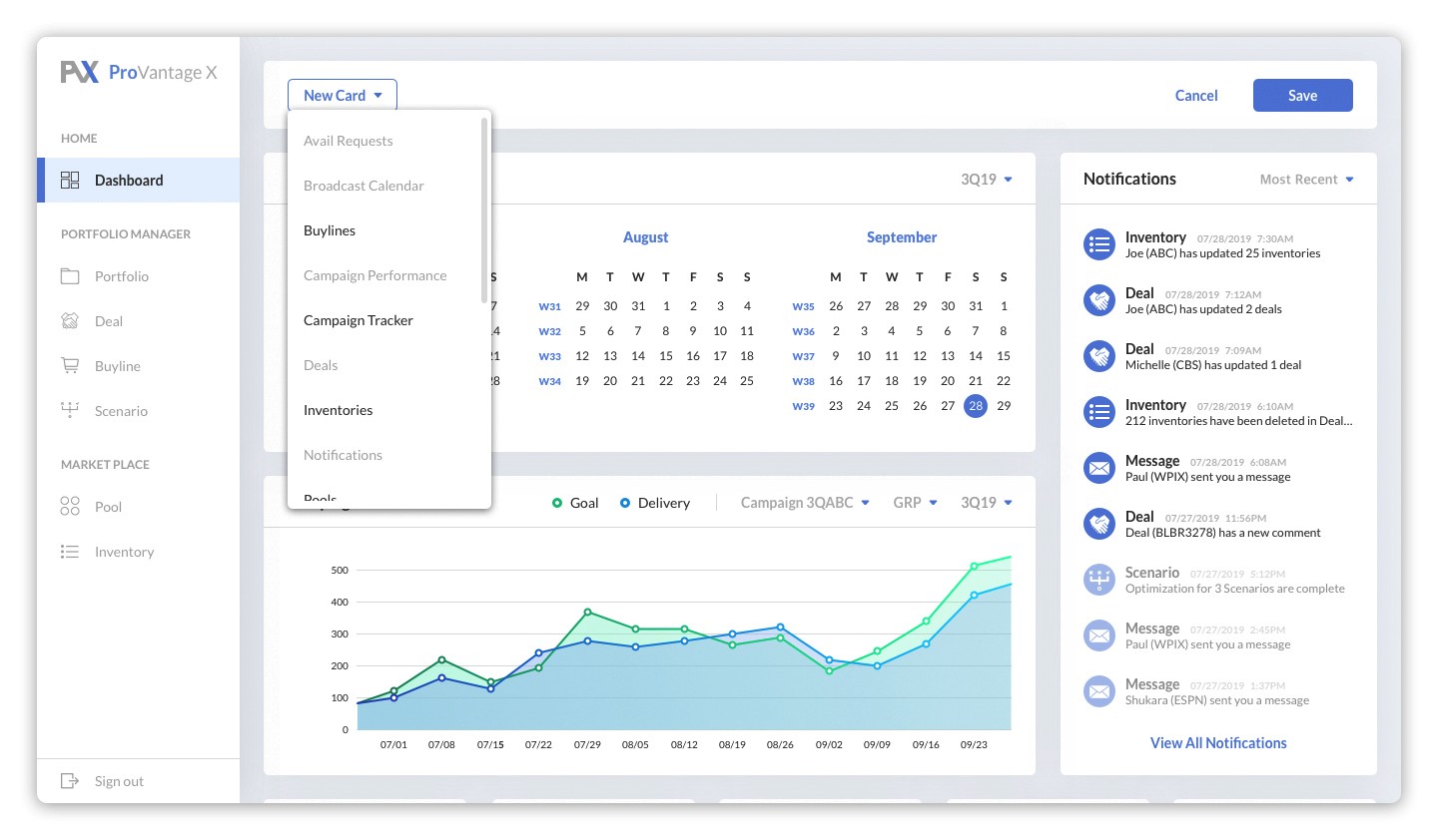
Transforming the landing page into a Dashboard with useful widgets such as summaries, guides, charts, etc.
Tables and graphs will provide the user with a quick overview of the current campaigns
Summaries and notifications will remind the user where he/she left, and what tasks need to be done
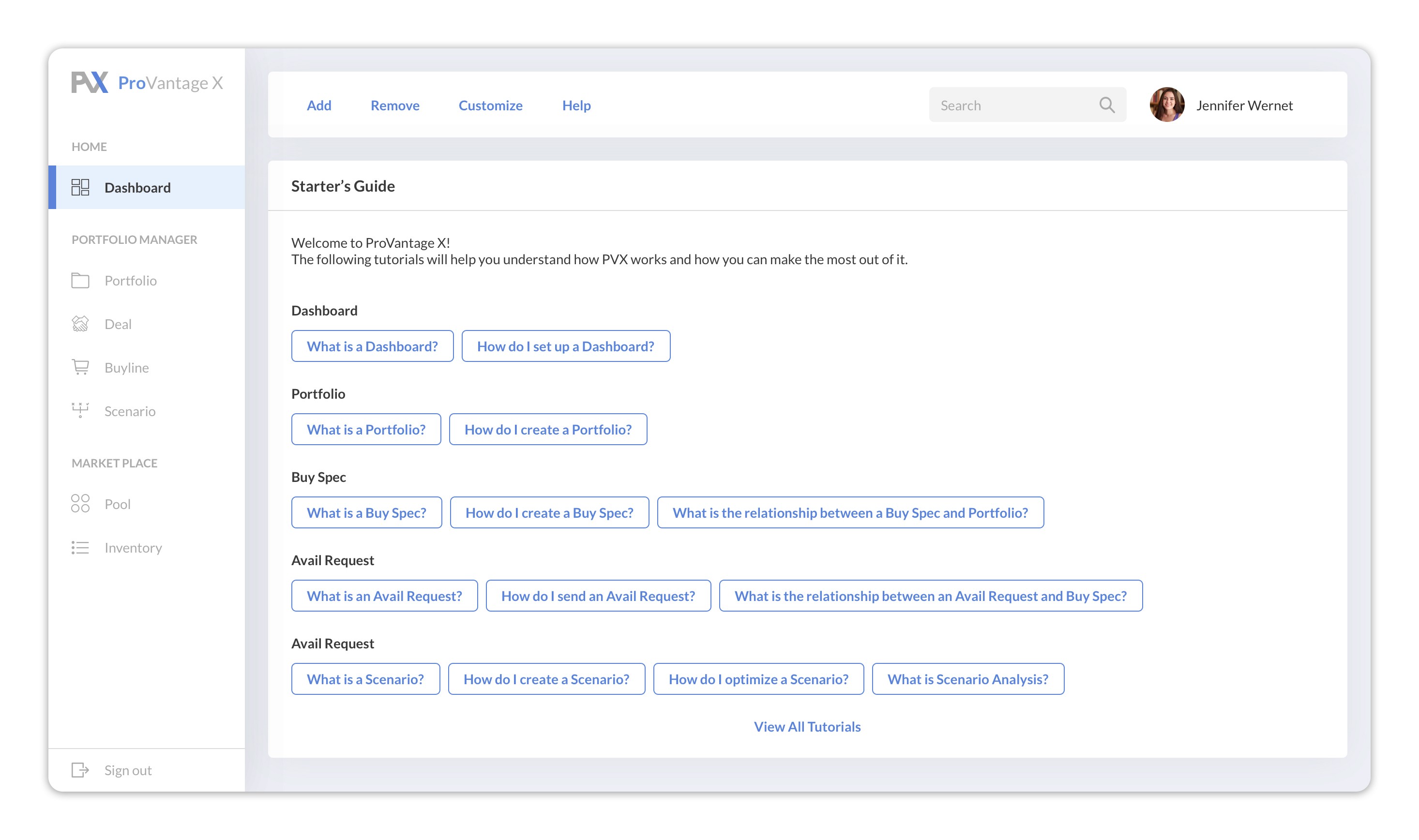
Creating tutorial content for the platform inside a guide widget in the dashboard
Users can view the tutorials as soon as they land on the dashboard (landing page).
The tutorials will help the users learn how to navigate through the platform as well as how to use each feature
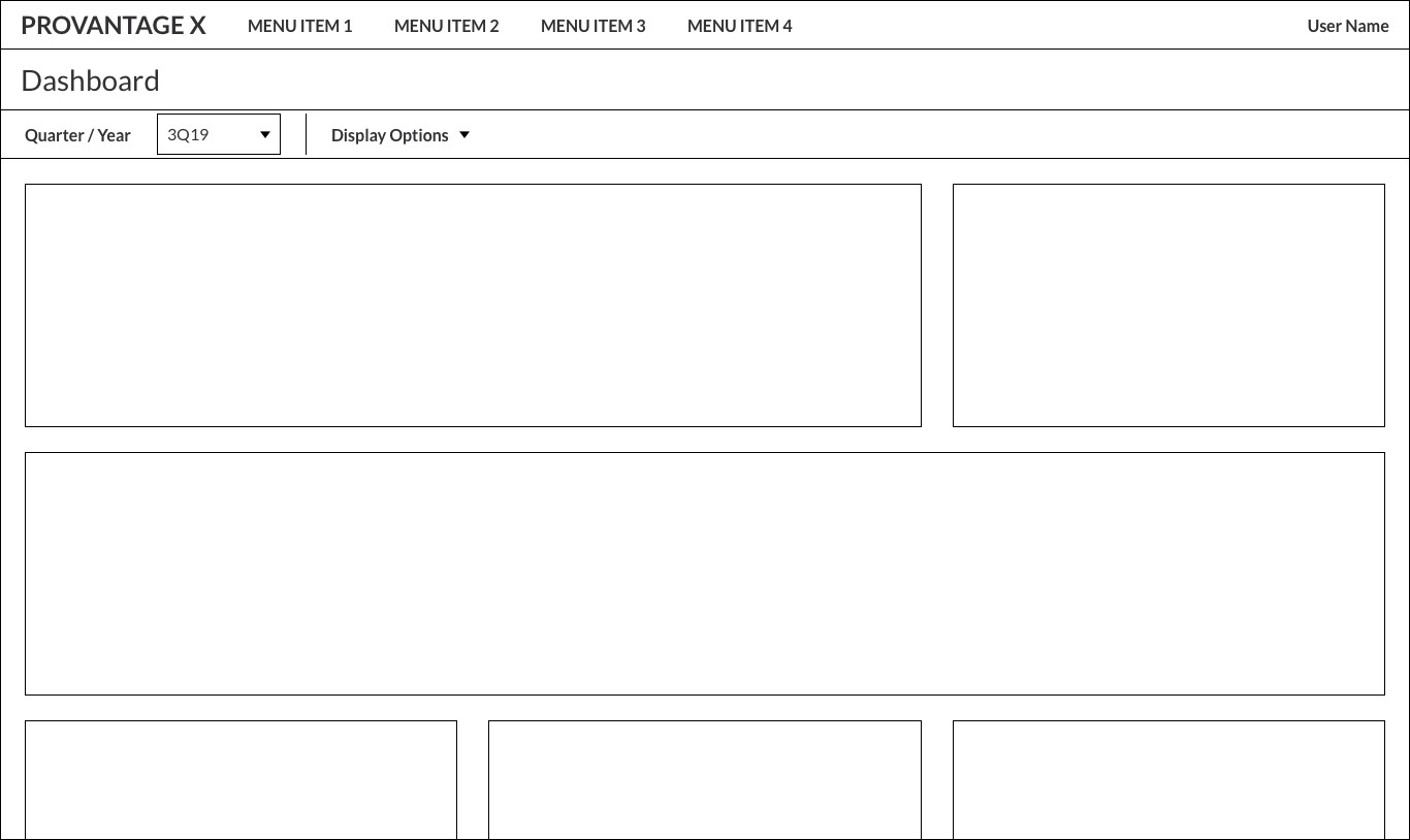
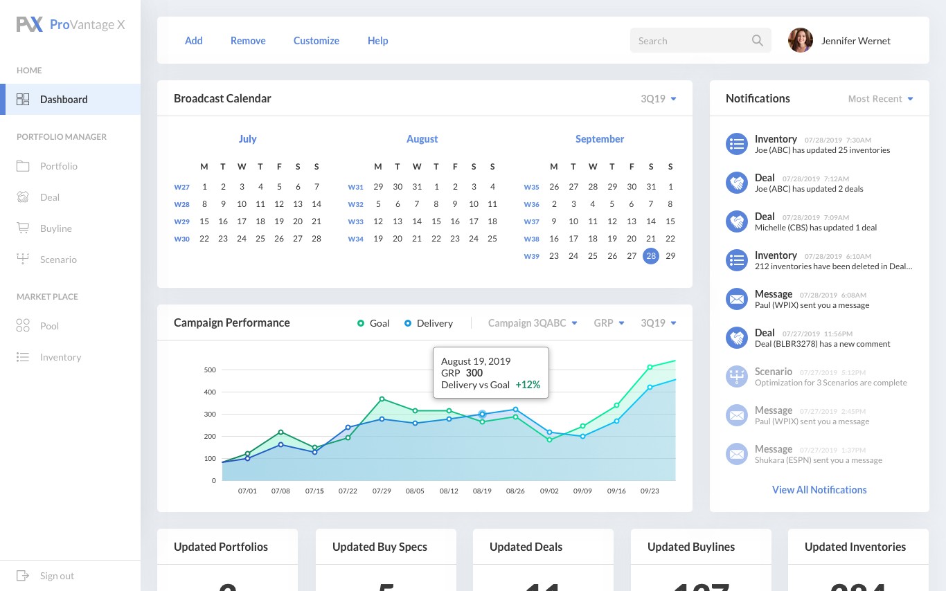
Initial wireframe for new landing page
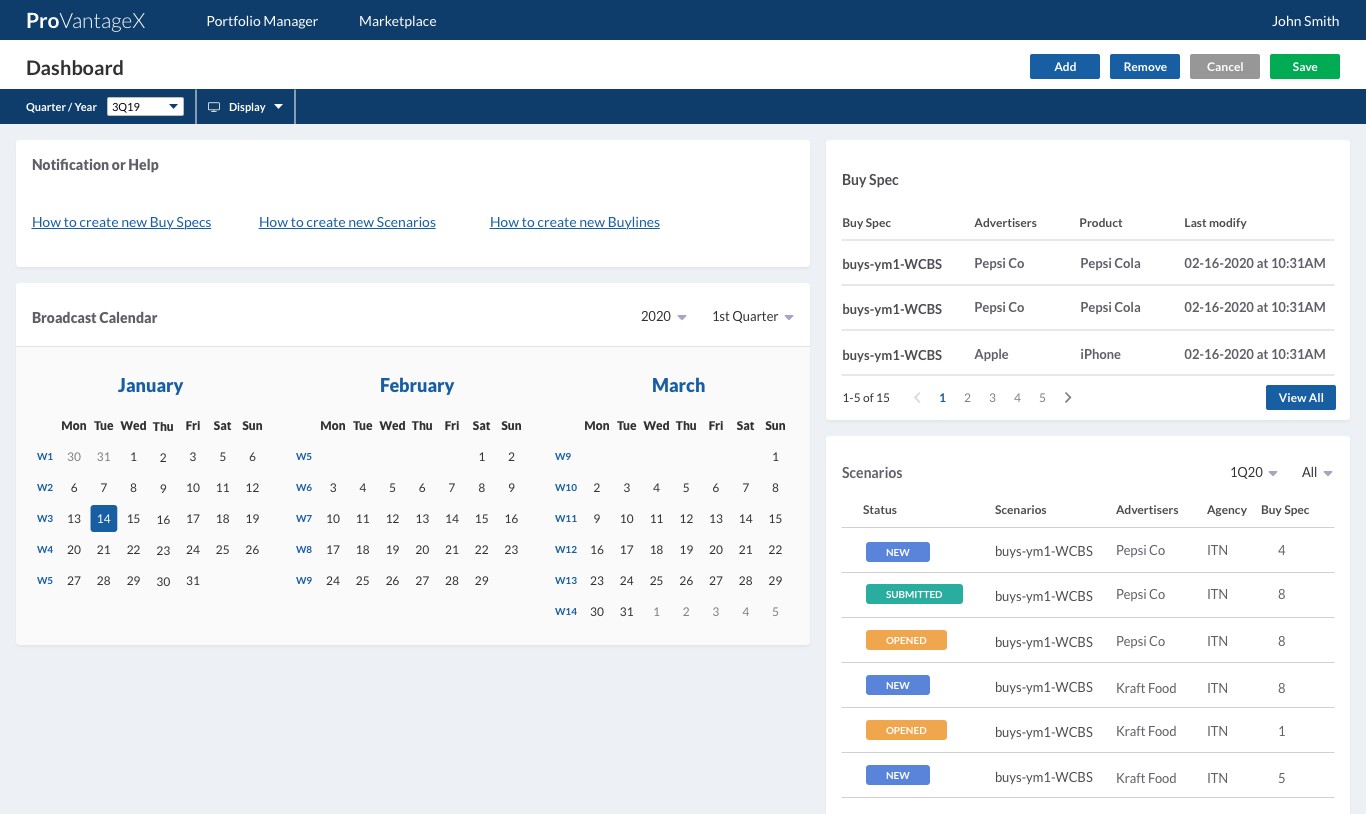
Iteration for new landing page 1
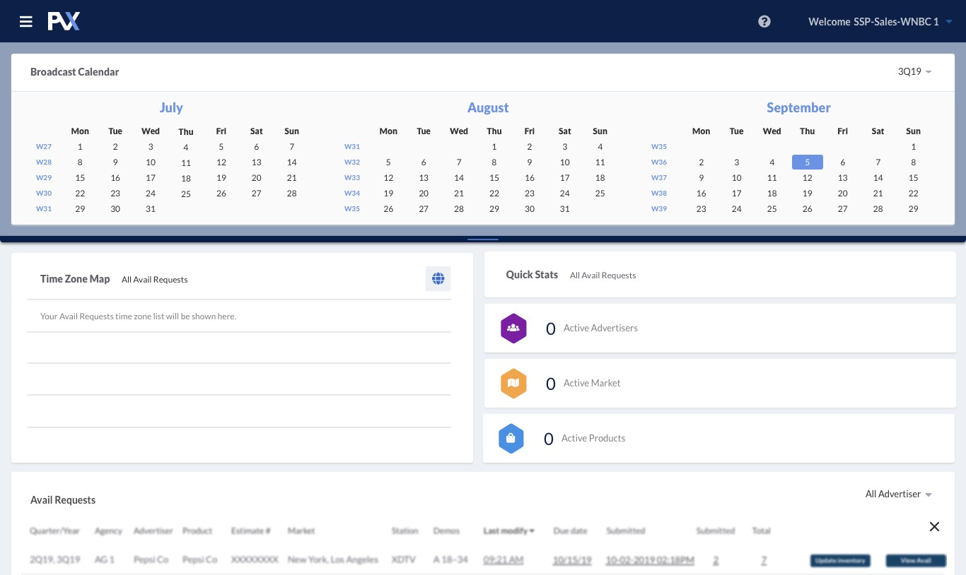
Iteration for new landing page 2
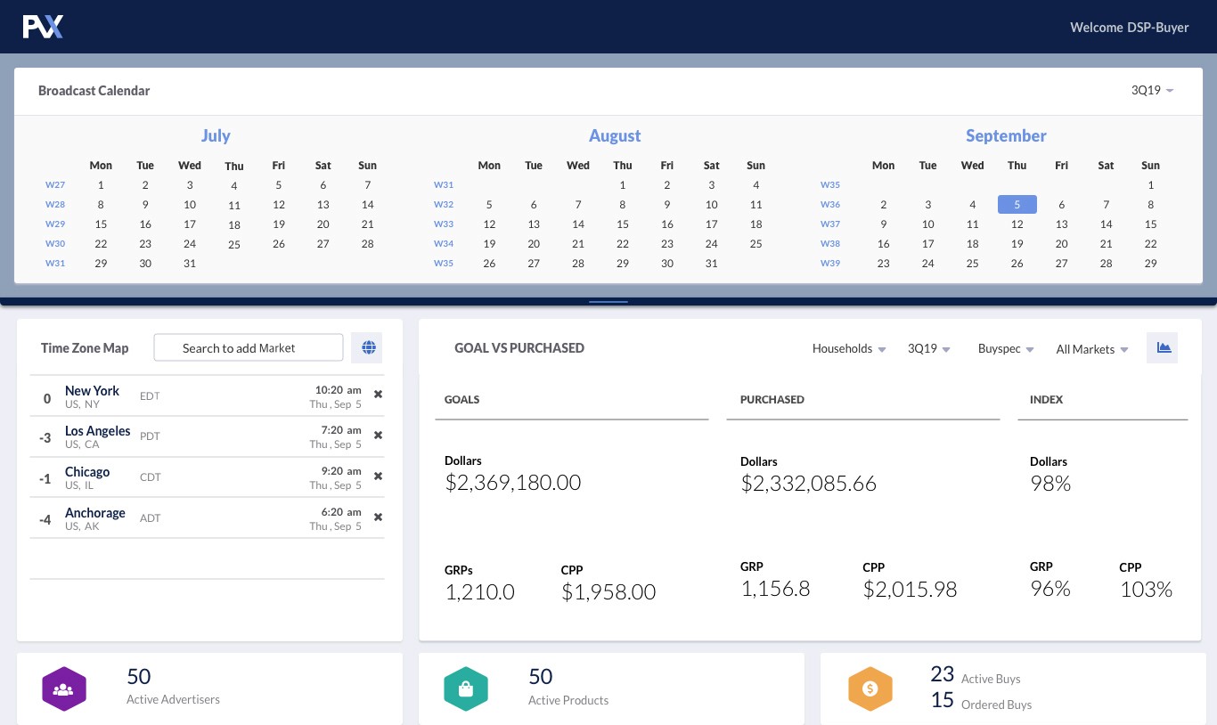
Iteration for new landing page 3
Feedback
Very positive feedback on the widgets with functions and short cut links
Users also excited to see examples of different widgets with graphs and notifications
Tutorials will be very helpful for first time users, but the navigation itself is still not intuitive and still needs improvement
Majority of users do not like the top nav bar because it only displays the top level information. Submenu items are hidden until the users hover over each main menu item
Visual Design is still not appealing
This could be a good opportunity to revamp the overall design of the platform, since users are not very happy with the current visual design
Try to create a new look and feel for the platform starting with the landing page/dashboard. Feel free not to be restricted by the existing components and visuals
Final Redesign
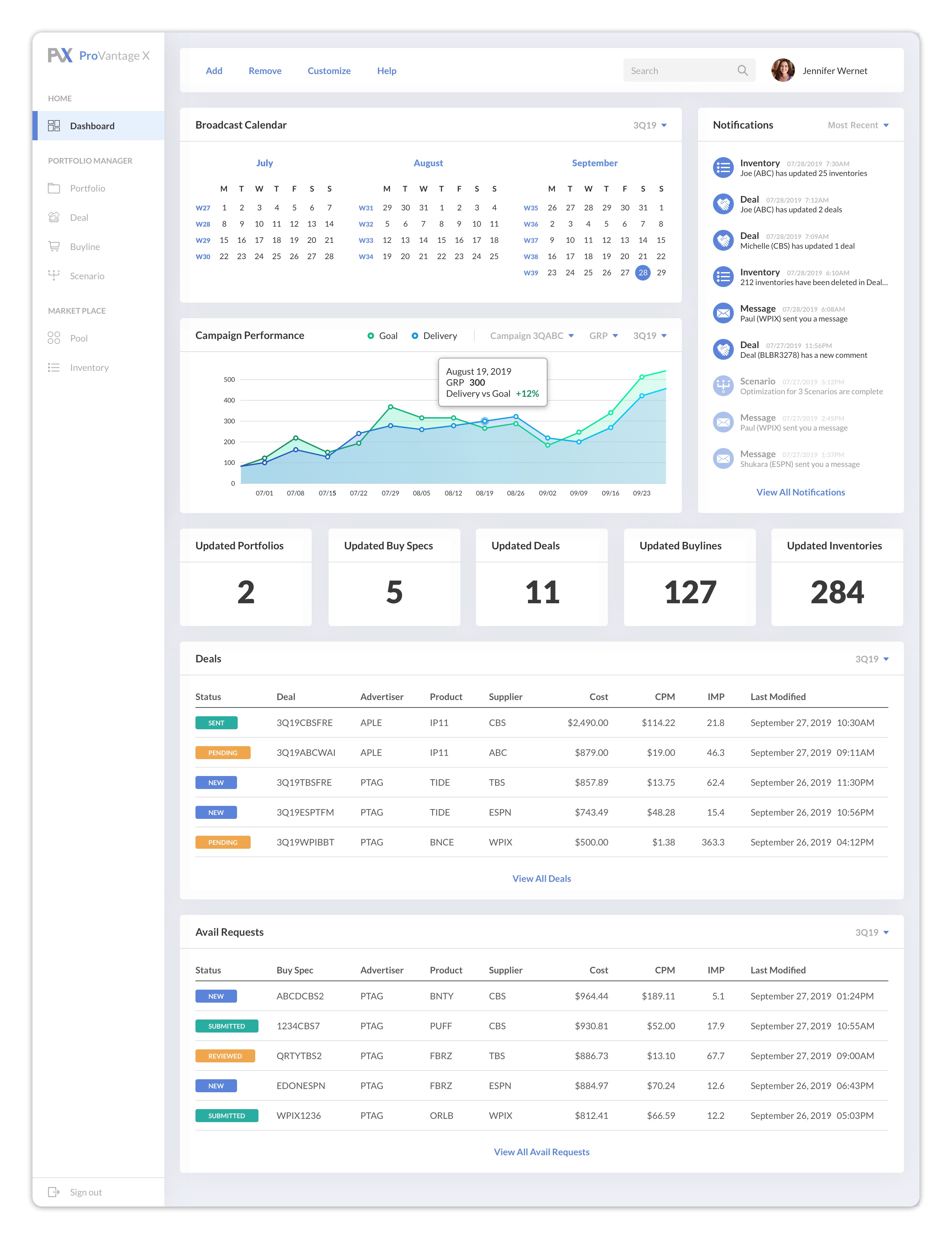


Key improvements for 2nd redesign
Redesigning the visual interface of the landing page/dashboard, which will be the starting point for redesigning the entire platform interface
At this point, I was granted the freedom to part ways with the current product style
Top Navigation Bar moved to the left side
This will allow all the submenu items to be displayed at once as well as the main menu items
While the side menu bar would be hidden in other screens, it will remain open in the landing page/dashboard in order to help the users navigate through the platform
Next Steps
Apply the new UI Interface design in different sections of the platform
Make the change from Top Navigation Bar to Side Navigation Menu through out the entire system
Research for more specific needs from different types of users and design widgets that accommodate those needs
For more details about the project, please contact jtk8682@gmail.com