
What is the Novitas Design System?
Google’s official design system is Material Design. While a good amount of people know about this, not many are aware that this actually branches out into multiple variants. Often different product teams within Google will customize Material Design and create their own design system to fit their purpose and usage better. Novitas is the official design system used for the Google Workspace Admin Console.
Screenshot of the Novitas Sticker Sheet file in Figma
Who were the users?
All design and engineering teams working on Admin Console were the main users of Novitas. Also there were often cases where different Google Workspace product teams needed to work on a specific admin experience for their own projects as well.
What was my role?
When I first joined the company, there was one administrator, who was managing the entire Novitas Design System. However maintaining a design system takes a great amount of time and effort, and the main administrator was looking for someone to help. So I decided to join him and become the supporting administrator. Below are a few examples of what my common tasks included
Managing Figma design files, design documents, and slides
Monitoring Admin Console to make sure components and patterns are being used correctly
Improving design system by adding new components and patterns
Consulting with partner teams when asked for help on Novitas usage
Managing design files
As mentioned above, managing the Figma design files was one of my responsibilities. A common situation that requires this is when someone with edit access accidentally changes a component, or an update from the root file affects our components in an unintended way. In these situations, we need to fix and turn them back to their correct form as soon as possible.
Another situation is when Figma comes out with new features. After evaluating the feature, if we feel it is something that could be beneficial to our users, we will work on updating the components with the feature. The video below displays text fields being tested with the new variant feature, which helped designers create mockups much more efficiently.
Video of the text field components being tested with new variant features
Monitoring Admin Console
Monitoring the Admin Console to make sure components and patterns were being used correctly everywhere, was important for providing a consistent user experience. While monitoring, if I discovered a component that was being used incorrectly, I usually direct contacted the UX owner of the page and asked them to correct it.
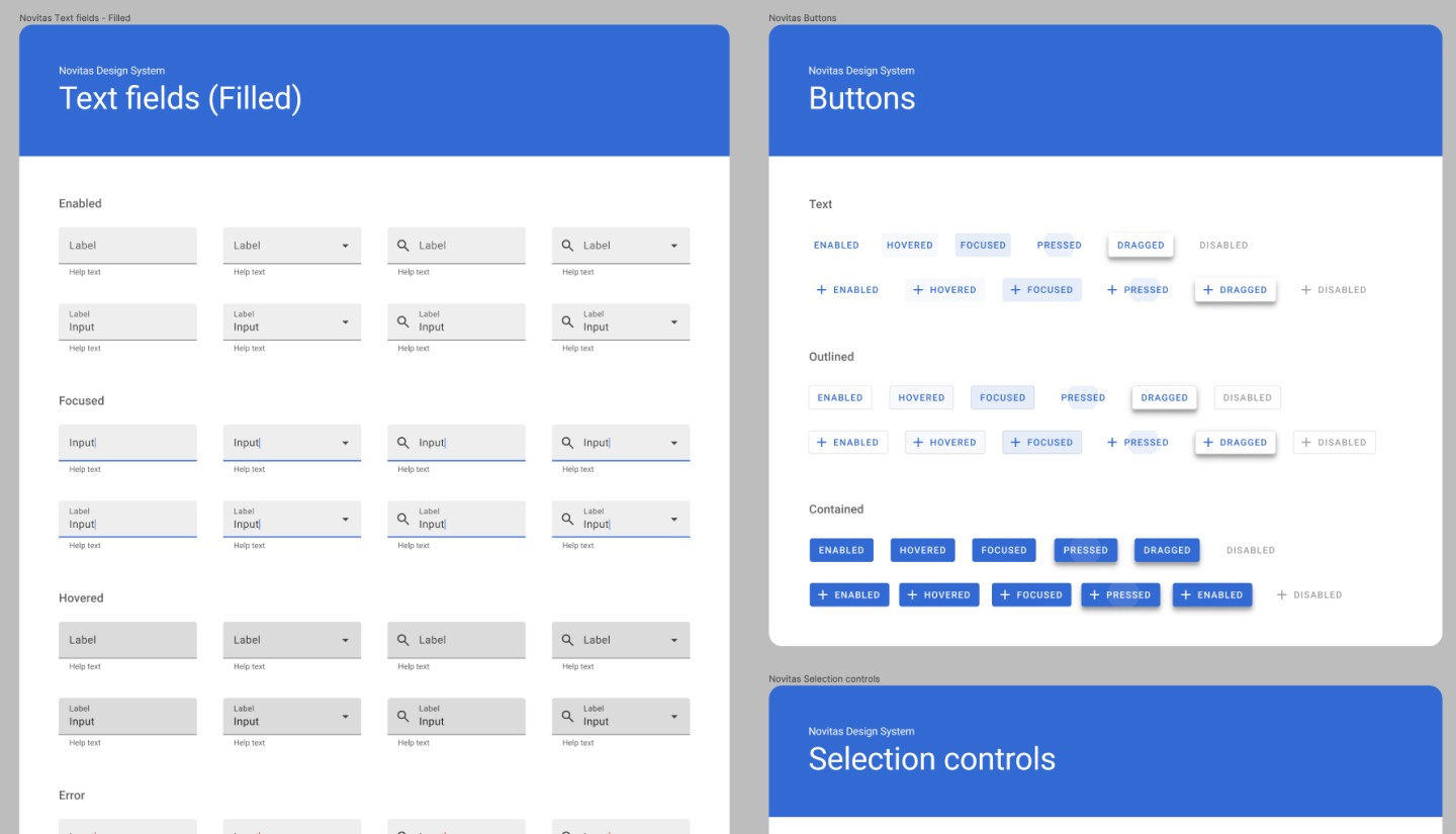
Text field unification
There were also cases that required a larger effort and turned into an actual project. A good example of this was the text field unification project. When the Admin Console was first built, there was not much structure in place and different teams worked on different parts without proper communication. As a result, the product grew organically and two different styles of text fields were used in an irregular fashion.
Having two different types of text field was an issue for UX consistency by itself, but there was an even more urgent issue that needed to be fixed. The two styles that were being used were floating text fields and filled text fields. While both of these styles were valid in Material Design 1, the floating text fields were deprecated in Material Design 2, due to the fact that they did not meet the GAR 4 requirements for Accessibility. As this also meant the pages that were using these text fields were not meeting the Accessibility requirements, we needed to change them as soon as possible.
After some UX research and discussion with the main administrator, it was agreed that eventually we would want to update to the outlined text fields. However we needed to be careful in creating our game plan. The components at the time were not using any high level tokens and needed to be updated manually. And if we tried updating to the outlined text field right away, that meant we would have three different styles co-existing in the product until this whole project was done. So instead, we decided to first unify the current text fields to filled text fields. When this first step is completed, we believed it would be a relatively easier task to convert to another style in the future.
Once we had the game plan, things got more straight forward. I started off by presenting my plans in the team UX share sessions. This was essential as I needed to notify all the designers to stop using the floating text fields moving forward. Then the final step was to backtrack the pages that were currently using the floating text field, and one by one request for an update.

A comparison of different types of text fields
Adding a new component
Design systems should continuously improve, and one way to do so is by adding new components that can meet various user needs. However, adding a new component is not a simple task. The image below, displays what elements our design system consists and also the steps that need to be taken when adding a new component or pattern.
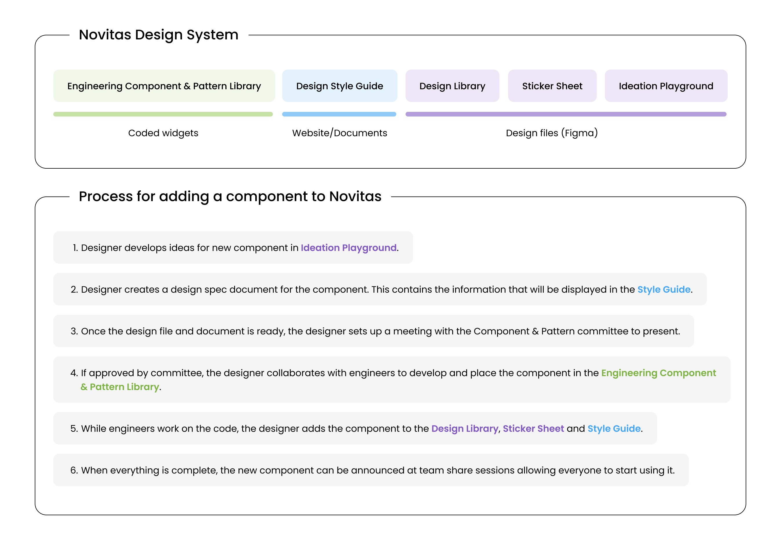
Process for adding a new component to Novitas Design System
My experience of adding a new component
Usually components are added to the design system first, then implemented to the product. However, there are also interesting reverse cases where a custom component, implemented to the product first due to a special need, will later be added to the design system.
I actually had this unique experience, while working on the Enhanced menu. When I was the UX owner of the SIT (Security Investigation Tool), I noticed that there were many dropdown menus in this tool that contained a huge amount of items. Since there were only flat menus in Novitas at the time, this meant the dropdown menus were super long and challenging to find the desired item. In fact, we were constantly receiving negative feedback from customers about the user experience. So I designed the Enhanced menu, a new menu component with Search, Pin, and Grouping features that helped the user quickly find and select an item.
Because this was a problem that we immediately needed to solve, we first implemented the custom component specifically for the SIT only. Interestingly this actually ended up working as if it was a Beta test. And with all the great feedback we received from customers and other designers on the team, it was soon decided that this component should be added to the Novitas design system, enabling other designers to include it in their own designs.
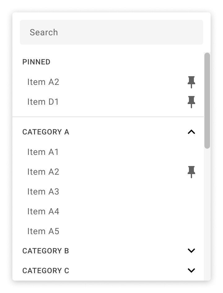
Enhanced menu with Search, Pin and Grouping features
For more details about the project, please contact jtk8682@gmail.com